 |
| Cartoon Courtesy of What the Duck |
Key #1: Great Lighting Matters More Than the Camera
Great lighting is more important than the camera you use.
Let's take a peek at two photos. One straight from my camera and the other straight off my cell phone. Both photos were taken in the best light possible around midday directly next to a window.
Let's take a peek at two photos. One straight from my camera and the other straight off my cell phone. Both photos were taken in the best light possible around midday directly next to a window.
Can you tell which photo came from my real camera and which one came from my cell phone? Both are focused pretty well and show adequate details. And that ugly gray background is equally present in both photos. So, please do not believe the lie that you need to spend hundreds on a camera to get a good photo.
In case you were wondering...Nel the Tiny owl was taken with my real camera and the yarn/needle was taken with my cell phone.
- Photograph your items next to a window during the day
- Try photographing at different windows throughout your house to see where the lighting is best
- Use a neutral background (Note: it takes editing to get a clear white background)
- Cloudy days offer filtered light. That is the best time to head outside with your items.
Key #2: Stage Your Photo and Play with Props
What is staging? According to about.com:
"It's about perfecting the art of creating moods....it's all about dressing the house for sale."
Except in our case, we aren't selling our house. We are selling our designs or finished objects.
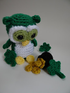
Staging your photo brings character and personality to your lifeless yarn. Without the pot of gold, Nel would just be some cute, green owl. But, with the pot of gold, it's more clear that he was created in the spirit of St. Patrick.
Key #3: A Little Goes a Long Way
A little what? Whatever it is that has you thinking, "if a little is good, then more is better."
Think about wearing make-up. You don't want a lot of gobbly-goop on your face. Just enough to bring out your natural beauty, right?
I thought the St. Patrick's Day them would be more evident if I threw in some shamrocks clovers.
It was just too much. It became too sloppy. What are you supposed to see? The focus isn't really on any one thing and rather than being pleasing to the eye, it confuses the mind. So, I went with the Less is more approach and ditched the clovers altogether.
Key #4: Editing Takes Photos From Good to Great
The goal of editing your photo is to create a pleasing, colorful image that accurately represents your product.
A little goes a long way here, too. The clovers were too much in the photo with Nel, but they turned out to be one of my favorite edited photos:
A little goes a long way here, too. The clovers were too much in the photo with Nel, but they turned out to be one of my favorite edited photos:
 |
| Photo Edited with The Gimp 2.8. Free Online Training here. |
The original photo was so shaded and gray that the yarn appeared darker than it actually is. It took just a minute to adjust the brightness and contrast to get a pleasing result that actually represents the real item. The actual color is called Jelly Bean and looks just like the after photo. Plus, that crisp, white background screams professional.
Wrap-up of the 4 Tricks
- Great Lighting
- Use Props to Make the Photo Fun
- A Little Goes a Long Way
- Edit Your Photos
If you use any of the tips mentioned in the post, leave a comment with your blog so I can come and check it out! I especially want to see your photos if you use props! Think of those little Lego men, your kid's Build-a-bear. It can be anything!! And I want to see them!!


No comments:
Post a Comment